The Snapchat logo, featuring a ghost, symbolizes messages that vanish after being viewed. Created by Evan Spiegel in one evening, it evolved over time but kept its essence. This article explores its history, design, and cultural significance.
Key Takeaways
-
The Snapchat logo, featuring a ghost icon, symbolizes ephemeral messaging and has undergone multiple redesigns to enhance inclusivity and recognition.
-
The logo’s vibrant yellow color scheme is distinctive within social media, signifying positivity and fun, while its design elements contribute significantly to brand recognition and user engagement.
-
Snapchat’s logo has evolved into a cultural icon, influencing digital branding strategies and communication styles, particularly among younger audiences.
The Evolution of the Snapchat Logo
The Snapchat logo’s journey showcases creativity and innovation. Co-founder Evan Spiegel designed it in one evening, capturing the essence of ephemeral messaging. The ghost icon, representing disappearing messages, has evolved into a cultural symbol along with the app.
The Snapchat logo has been redesigned multiple times to match the app’s evolving dynamics and user base. Each update aimed to simplify and enhance its appeal, making it more inclusive and recognizable. These changes reflect the app’s growth and commitment to a fresh visual identity.
Initial Concept and Creation by Reggie Brown
Evan Spiegel, though not a professional graphic designer, created the original Snapchat logo in a single evening. He chose a ghost icon to symbolize the app’s ephemeral messaging feature. This playful and distinctive choice highlighted messages that disappear after being viewed, setting Snapchat apart from other platforms.
Originally named ‘Picaboo,’ meaning ‘Photo of a Ghost,’ the app’s name was directly tied to the ghost emblem. This wordplay emphasized privacy and temporary communication while adding a whimsical touch to its brand identity.
Reggie Brown’s Contribution
Reggie Brown, one of the original founders of Snapchat, played a pivotal role in the app’s development. It was Brown who first envisioned an app where users could share pictures that would automatically delete after a set time. This innovative idea of disappearing messages was the cornerstone of Snapchat’s unique functionality. Brown brought this concept to Evan Spiegel, who had prior business experience, and together they began to develop what would become Snapchat.
Despite his significant contribution, Brown’s journey with Snapchat was cut short due to internal conflicts, leading to his ousting from the company. However, his foundational idea remains at the heart of Snapchat’s identity, underscoring the app’s commitment to ephemeral communication. Brown’s vision laid the groundwork for what has become one of the most popular social media platforms today.
Major Redesigns
In 2013, the Snapchat logo underwent its first major redesign, removing facial expressions from the ghost icon to create a more neutral design. This change aimed to make the logo more inclusive, representing a wider range of user emotions and interactions. This simplification helped the logo resonate with a diverse user base, becoming a more universal symbol of Snapchat’s identity.
Further redesigns refined the ghost icon, enhancing its visibility and appeal while maintaining the brand’s playful nature. These updates, well-received by the community, reflect Snapchat’s evolving needs and growing user base.
Design Elements of the Snapchat Logo
The Snapchat logo exemplifies effective design, combining vibrant colors, distinctive typography, and the iconic ghost to create a strong visual identity. Each element plays a crucial role in conveying the brand’s message and personality. The design elements also support app functionalities, such as notifications that alert users when their snaps are captured via screenshots, emphasizing the app's focus on privacy and temporary communication.
Color Scheme
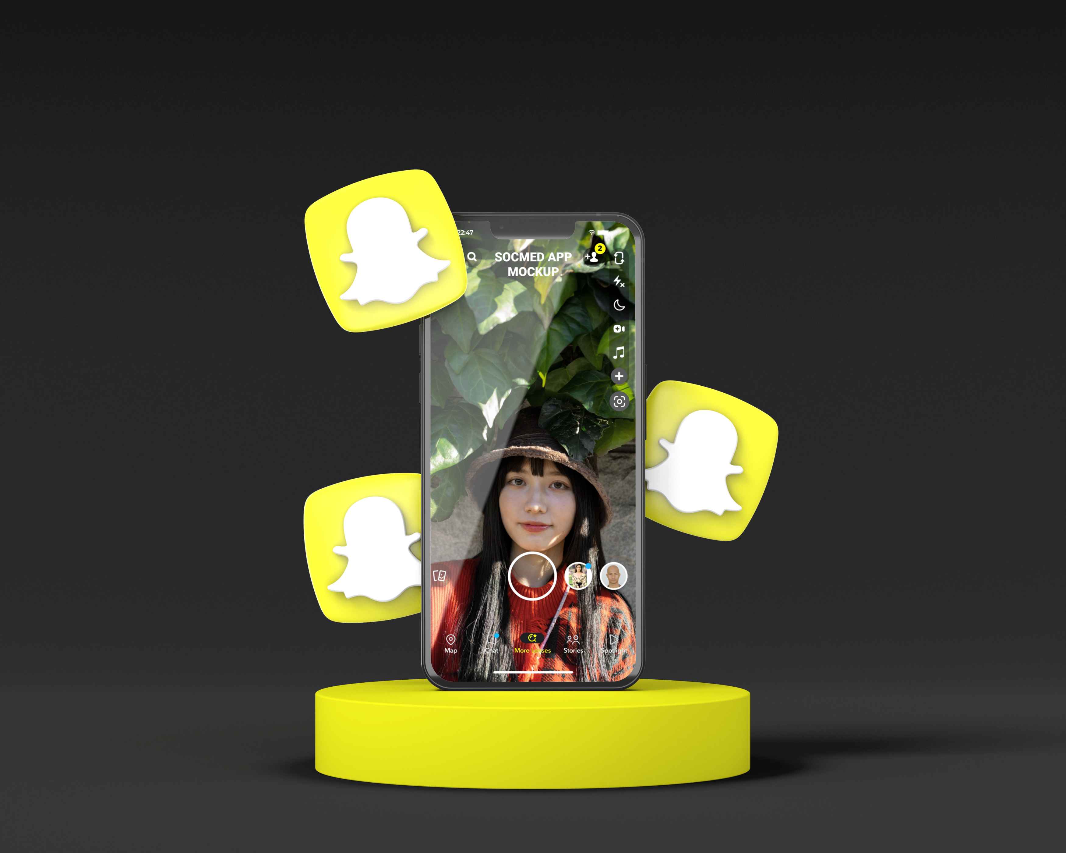
The Snapchat logo’s bright yellow background stands out, as yellow is often associated with happiness and optimism, aligning perfectly with the app’s fun and engaging user experience. This color choice also sets Snapchat apart from competitors who typically use blue tones.
The Snapchat logo’s color palette includes yellow, black, and white, each chosen for its psychological impact. Yellow signifies positivity and energy, black adds contrast, and white ensures the ghost icon stands out. This color scheme forges emotional connections with users, making the logo memorable.
Typography
The Snapchat logo uses the Graphik typeface, known for its modern and clean aesthetic. This choice complements the brand’s playful image while ensuring legibility and simplicity. Typography plays a crucial role in logo design, significantly impacting brand perception.
The Graphik font family adds sophistication to the otherwise whimsical logo, balancing professionalism and playfulness.
Ghost Icon
The ghost icon, affectionately named ‘Ghostface Chillah,’ lies at the heart of the Snapchat logo. It symbolizes the app’s ephemeral messaging feature, where messages vanish after being viewed. Over time, the ghost icon has undergone slight design changes to enhance visibility and appeal, embodying a neutral expression.
This central element represents the app’s functionality and adds a unique, memorable character to the brand.
The Impact of the Snapchat Logo on Brand Recognition

The Snapchat logo is a powerful tool for brand recognition. Its distinctive design has made it one of the most recognizable logos in social media, playing a crucial role in the app’s success and popularity. The logo's recognition has also extended to merchandise, with branded items like shirts and mugs sold through the Snap Store, further solidifying its presence in popular culture.
Its simplicity and uniqueness make it highly memorable, helping users easily identify and engage with Snapchat.
Visual Identity
A well-designed logo, like Snapchat’s, significantly enhances brand recognition and user loyalty. The playful ghost icon and vibrant colors create a strong visual identity users can quickly recall. The brain processes images faster than text, so a distinctive icon can boost logo recognition. Snapchat’s branding strategy focuses on creating a fun and youthful image, contrasting with the more professional tones of platforms like LinkedIn. The use of icons in branding can further enhance this recognition.
Snapchat’s ghost icon symbolizes the temporary nature of messages, emphasizing self-destructing content. This playful design resonates with users, particularly younger audiences, who associate it with fun and spontaneity. Significant redesigns have aimed at enhancing user engagement and aligning with evolving app functionalities.
User Perception
User perception of the Snapchat logo has generally been positive, with its playful and rounded font contributing to a friendly and approachable brand identity. The 2019 update, featuring a bolder outline for the ghost icon, aimed to enhance visibility from a distance, though it received mixed reactions.
Overall, the logo’s design elements resonate well with younger audiences, reinforcing the app’s image and ability to download as a fun and spontaneous platform.
Market Positioning
The Snapchat logo differentiates the brand in the crowded social media market. Its playful and youthful design stands out from competitors, establishing a unique identity that resonates with younger audiences. The ghost symbol, known as ‘Ghostface Chillah,’ has evolved into a recognizable emblem, reinforcing its market positioning.
Comparing Snapchat's Logo with Competitors
Compared to its competitors, the Snapchat logo stands out for its unique design and color scheme. While many social media platforms opt for formal and subdued logos, Snapchat’s playful ghost icon and vibrant yellow background communicate fun and spontaneity.
This distinctive approach helps Snapchat maintain a strong visual identity in a crowded digital marketplace.
Unique Features
Snapchat’s use of bright yellow is unique, as few other social media platforms use this color. This bold choice enhances visibility and reinforces the app’s association with happiness and positivity.
In a sea of blue and white logos, Snapchat’s bright and playful design stands out, making it instantly recognizable.
Branding Strategies
Snapchat’s branding strategy leverages its playful aesthetic to connect with younger audiences, contrasting with the serious and professional branding of platforms like LinkedIn. The ghost logo’s design has influenced various digital branding strategies, promoting playfulness and immediacy.
The cultural impact of the Snapchat logo extends beyond the app, inspiring other apps to adopt similar playful aesthetics. This influence reflects Snapchat’s branding strategy, focusing on creativity and spontaneity to engage users. The logo has become a cultural icon, symbolizing Snapchat and the broader concept of temporary digital interactions.
Fun Facts About the Snapchat Logo

The story behind the Snapchat logo is filled with interesting trivia that adds to its charm. For instance, Evan Spiegel created the original logo in just one evening, despite not being a trained graphic designer. This quick yet impactful creation underscores the spontaneity that Snapchat embodies. Snapchat representatives have often been reached for comment regarding privacy concerns, emphasizing the importance of transparency and accountability in the app's data practices.
Hidden Meanings
The ghost in the Snapchat logo is named Ghostface Chillah, inspired by the rapper Ghostface Killah from the Wu-Tang Clan. Thicker borders were introduced to enhance visibility and user recognition from a distance.
These hidden meanings and design tweaks deepen the understanding of the logo’s significance and its connection to popular culture, allowing us to discover its deeper relevance.
Cultural Impact
The Snapchat logo has become a cultural icon, symbolizing spontaneity and the transient nature of modern communication. Globally, the logo has transcended branding, influencing social interactions and communication styles.
This widespread cultural impact highlights the logo’s role in representing self-expression and a fundamental part of everyday digital communication.
Criticisms and Concerns

Over the years, Snapchat has faced several criticisms and concerns, particularly regarding user privacy, data security, and the app’s impact on mental health. Users have expressed worries about Snapchat’s ability to collect and store extensive user data, including location information and browsing history. These concerns are heightened by the app’s ephemeral nature, which some fear could facilitate cyberbullying and online harassment.
In response to these issues, Snapchat has implemented various measures to enhance user safety and privacy. These include end-to-end encryption for messages and the introduction of features designed to promote well-being, such as tools to report and block abusive content. Despite these efforts, the app continues to navigate the complex landscape of digital privacy and user safety, striving to balance innovation with responsibility.
Controversies Surrounding the Logo
The Snapchat logo, while iconic, has not been without its controversies. Some users have criticized the design as overly simplistic or even childish, questioning whether it accurately reflects the app’s broader functionality beyond ephemeral messaging. Critics argue that the ghost logo, while playful, might not convey the full range of features Snapchat offers.
Despite these criticisms, the Snapchat logo has achieved remarkable success and recognition. Its simplicity and distinctiveness have made it one of the most recognizable logos in the world. The design’s effectiveness lies in its ability to communicate the app’s core concept quickly and memorably, proving that sometimes, less is more.
Snapchat Logo and App Functionality
The Snapchat logo is more than just a visual identifier; it is a representation of the app’s core functionality. The ghost icon, known as Ghostface Chillah, symbolizes the ephemeral nature of Snapchat messages, which disappear after being viewed. This design choice effectively communicates the app’s unique selling point: the ability to send temporary photos and messages.
The bright yellow background of the logo evokes a sense of excitement and energy, aligning with the app’s dynamic and engaging user experience. The logo’s simplicity and recognizability have made it a powerful symbol of the Snapchat brand, influencing how users perceive and interact with the app. Its design has been widely imitated by other social media platforms, underscoring its impact on digital branding.
By maintaining a consistent visual identity, the Snapchat logo reinforces the app’s promise of fun, spontaneous communication, making it an integral part of the user experience.
How to Create Your Own Snapchat-Inspired Logo

Creating a Snapchat-inspired logo involves considering the impression you wish to convey, whether minimalist, abstract, or monogram style. The Snapchat logo’s success lies in its simplicity and the emotional connection it forges with users. These tools provide access to a wide range of design capabilities, allowing users to create logos that are both unique and functional.
Design Tools
Several design tools can help you create a Snapchat-inspired screen logo. Canva is highly recommended for its user-friendly interface and extensive template library, suitable for both novices and professionals.
Adobe Express offers a variety of customization options, ideal for users familiar with the Adobe ecosystem. Wix’s logo maker provides automated templates that simplify the design process, making it accessible for beginners.
Best Practices
Details and creativity are essential for crafting a memorable logo that stands out. Consistency with your brand identity can attract and retain customers.
Implementing these best practices can make logos leave a lasting impression and bolster brand recognition.
Summary
In summary, the Snapchat logo is a remarkable example of effective branding that encapsulates the essence of the app’s playful and ephemeral nature. From its initial creation by Evan Spiegel to its various redesigns, the logo has evolved to meet the changing needs of its user base while maintaining its core identity. The bright yellow color, playful ghost icon, and modern typography all contribute to a logo that is not only memorable but also deeply connected to the brand’s identity. As we’ve seen, the logo’s impact extends beyond mere recognition; it influences user perception and market positioning, making Snapchat a unique player in the social media landscape. Whether you’re a designer looking for inspiration or a brand enthusiast, the story of the Snapchat logo offers valuable insights into creating a compelling visual identity.
Frequently Asked Questions

How has the Snapchat logo evolved over the years?
The Snapchat logo has transitioned from a ghost with facial expressions to a more streamlined and neutral design, symbolizing the app's expansion and appeal to a wider audience. This evolution underscores Snapchat's adaptability in a changing social media landscape.
What design elements make the Snapchat logo stand out?
The Snapchat logo stands out due to its bright yellow background, the playful ghost icon known as Ghostface Chillah, and the use of a modern Graphik typeface. These elements combine to create a distinctive and memorable visual identity.
How does the Snapchat logo enhance brand recognition?
The Snapchat logo enhances brand recognition through its simplicity, distinctive color scheme, and playful design, which make it easily identifiable and relatable to users. This effective branding fosters user engagement with the app.
What tools can I use to create a Snapchat-inspired logo?
You can effectively create a Snapchat-inspired logo using user-friendly tools such as Canva, Adobe Express, or Wix’s logo maker, which offer extensive customization options.
Why is the Snapchat logo significant in youth culture?
The Snapchat logo is significant in youth culture because it embodies spontaneity and the fleeting nature of modern communication, aligning closely with the values and behaviors of younger audiences. This connection influences how they interact socially.